
Exploring the difference between two of nature’s most beautiful colors – salmon and coral – can be a captivating journey.
While both colors can bring a sense of vibrancy and beauty to any surface, there are several key differences that can make one more preferable than the other for certain projects.
In this blog, we will dive deeper into the differences between salmon color and coral color to help you decide which hue is best for your next project.
What is Salmon Color?
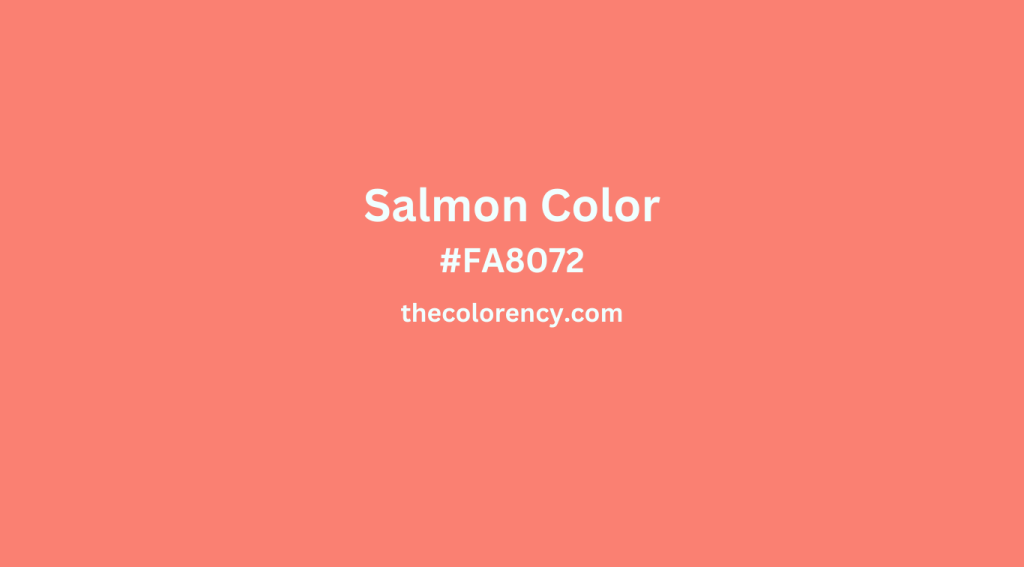
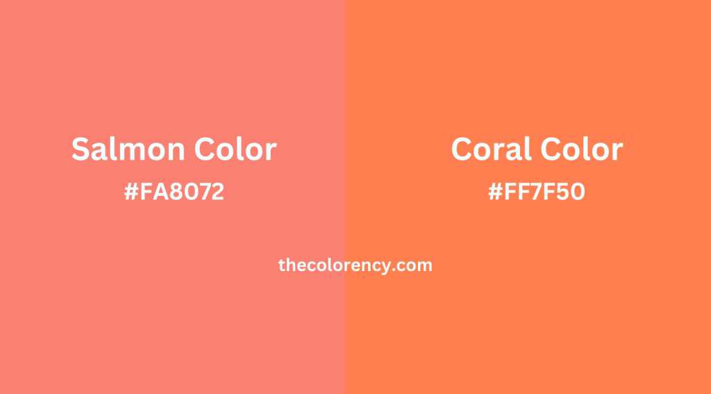
Salmon color is a pinkish-orange hue with a warm undertone. It is often described as a pinkish-orange that is slightly softer and lighter than coral. In the RGB color wheel, salmon color has a hue angle of 25.7° and is made up of the following components: red (255), green (168), and blue (105). The CMYK color wheel also features salmon color, and it is composed of cyan (0%), magenta (17%), yellow (59%), and black (5%).
When used in design, salmon color can evoke feelings of warmth and romance. It is often used to create a cozy and inviting atmosphere, and it pairs well with many other colors, including teal, navy blue, and silver.
What is Coral Color?
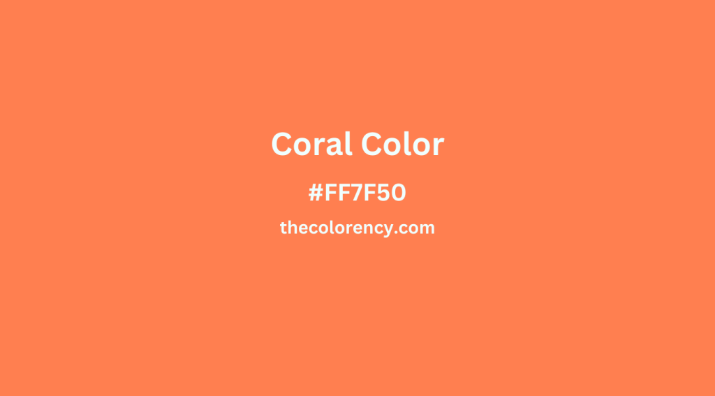
Coral color, on the other hand, is a bright, pinkish-orange hue with a warm undertone. In the RGB color wheel, coral color has a hue angle of 16.3° and is made up of the following components: red (255), green (127), and blue (80). The CMYK color wheel also features coral color, and it is composed of cyan (0%), magenta (30%), yellow (69%), and black (0%).
Coral color is often used in designs that evoke feelings of joy and energy. It is often used in summer-themed designs, and it pairs well with many other colors, including yellow, turquoise, and pastels.
Salmon Color Vs Coral Color
Now that we have a better understanding of both salmon color and coral color, let’s take a closer look at how they differ from each other.
The most obvious difference between the two colors is the intensity of the hue. Salmon color is a slightly softer and lighter hue than coral color, which is much brighter and more vibrant.
Another difference between the two colors is the way in which they evoke emotion. Salmon color is often used to create a cozy and inviting atmosphere, while coral color is often used to evoke feelings of joy and energy.
Finally, the two colors pair differently with other colors. Salmon color pairs well with teal, navy blue, and silver, while coral color pairs well with yellow, turquoise, and pastels.
When to Use Salmon Color and Coral Color
When deciding which color to use for your project, it is important to consider the desired emotion, the other colors used in the design, and the overall feeling of the room.
For a cozy and inviting atmosphere, salmon color is a great choice. This color pairs well with navy blue and silver, and it can be used to create a soothing and calming feel.
If you are looking for a color that will evoke feelings of joy and energy, then coral color is a great choice. Coral color pairs well with yellow, turquoise, and pastels, and it can be used to create a bright and cheerful atmosphere.
Conclusion
Salmon color and coral color are two of nature’s most beautiful colors, and understanding the differences between the two can help you choose the right hue for your next project. While both colors can bring a sense of vibrancy and beauty to any surface, their intensity, emotional evocation, and color pairings are distinct. Salmon color is a slightly softer and lighter hue than coral color, and while salmon color is often used to create a cozy and inviting atmosphere, coral color is often used to evoke feelings of joy and energy. Ultimately, the decision on which hue to use should be based on the desired emotion, the other colors used in the design, and the overall feeling of the room.