
Do you ever find yourself staring at a color palette, wondering which shade of purple to choose? The truth is, not all purples are created equal. Lavender and purple may seem similar, but they have distinct differences that can make or break a design. In this ultimate color showdown, we are going to explore more details about “Lavender Vs Purple”, such as the nuances of these two colors, their unique meanings, and when to use them.
Lavender Vs Purple: What’s the Different?
Introduce Lavender in One Sentence
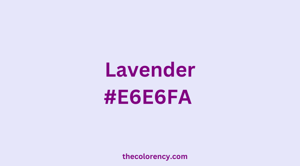
Lavender color is a pale, light purple shade named after the flower of the same name, often associated with calmness and femininity.
Introduce Purple in One Sentence
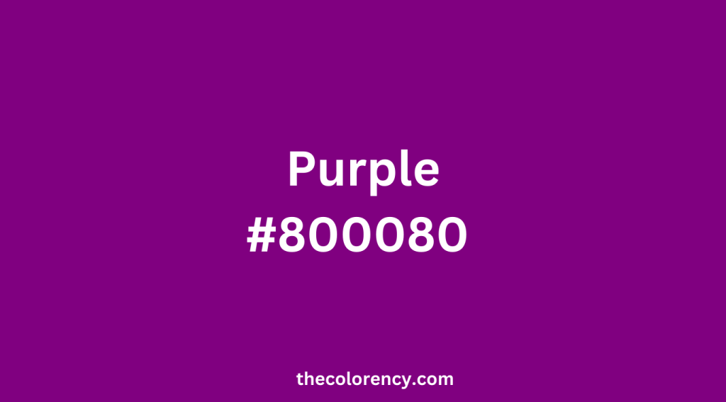
Purple color is a rich, deep hue created by combining blue and red, often associated with royalty, luxury, creativity, and spirituality.
Base Color of Lavender and Purple
Both Lavender and Purple have blue as their base color, as they are created by combining different amounts of blue and red pigments. However, the specific shades of lavender and purple can vary depending on the exact ratios of blue and red used.
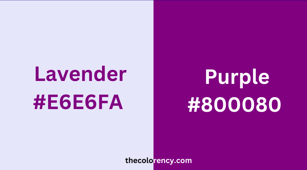
Lavender Vs Purple: HEX Codes & RGB values
Lavender
- HEX code: #E6E6FA
- RGB values: (230, 230, 250)
Purple
- HEX code: #800080
- RGB values: (128, 0, 128)
How to Distinguish
Saturation
In comparison to purple, lavender tends to have a lower saturation, resulting in a diminished level of intensity or brightness. People often describe the appearance of lavender as “dusty” or “pale,” whereas purple can cover a wide range, from vivid and lively to profound and melancholic.
Undertones
In terms of undertones, lavender generally leans towards blue, whereas purple can exhibit more red or blue undertones depending on the particular shade. As a result, this may affect the perception of the colors under varying lighting conditions or when combined with other colors.
Use in design
Lavender is commonly used in soft and delicate designs, while purple can be used in both understated and daring ways. For instance, designers can use lavender in vintage-inspired designs, pastel palettes, or floral patterns, while purple is suitable for modern or edgy designs, as a striking accent color, or for branding luxury products.
Cultural associations
Different cultures may have different associations with lavender and purple. Some Asian cultures associate purple with mourning or death. In Western cultures, purple may be associated with royalty or nobility.
Where Does the Name Come From?
The name “lavender” comes from the lavender plant. (The lavender plant, which is a member of the mint family and is known for its fragrant purple flowers, gives its name to the color “lavender”.)
The name “purple” comes from the Latin word “purpura,” which was used to describe a specific type of mollusk that was harvested to create a rich, red-purple dye that was used to color clothing for royalty and other wealthy individuals in ancient times. The use of this dye was a labor-intensive process, which made purple clothing a symbol of wealth and status.
Difference in color collocation
Lavender and purple are both variations of the color violet, but they have distinct differences in their hues and tones. Lavender is a light, pinkish or bluish purple. And purple is darker and more saturated with a red or blue undertone.
When it comes to color coordination, lavender pairs well with soft pastels such as light pink, baby blue, and pale yellow. It can also be complemented by neutral colors like white, beige, and gray. Lavender can create a calming and serene atmosphere, making it a popular choice for bedrooms, bathrooms, and spas.
On the other hand, purple is a bolder color that can add drama and sophistication to a space. It pairs well with other jewel tones like emerald green, ruby red, and sapphire blue. It can also be balanced out with neutral colors like black, white, and gray. Purple creates a luxurious and opulent feel, popular in formal spaces and high-end branding.
While both lavender and purple are variations of the color violet, their distinct differences in hues and tones affect how they can be used in color coordination. Lavender tends to create a more calming and serene atmosphere, while purple can add drama and sophistication to a space.
Final Thoughts
When choosing between lavender and purple for your design, consider their unique strengths that can elevate your project. Lavender’s softness and calming effect can create a soothing environment, while purple’s rich and regal appearance demands attention and creates a bold statement. Choose the color that best fits your vision.