
If you think beige and cream are interchangeable, think again! These two neutral colors may seem similar at first sight, but they have distinct differences that are worth exploring. Fashion and interior design enthusiasts alike have been using these hues for years, but it’s time to truly understand what sets them apart. In this article, we’ll delve into the world of beige and cream, examining their unique features and sharing some expert tips on how to use them to enhance your designs. Get ready to discover more details about “Beige Vs Cream”.
What is Beige
Beige is a light brown color with a hint of yellow.
It’s often described as a warm, neutral color and is commonly used in interior design.
Beige can be used as a primary color or as a complementary color to other colors like blue or green.
What is Cream

Cream is a light, warm color with a slight hint of yellow.
It’s similar to beige but is a bit lighter and has less brown in it.
Interior designers often use cream as a neutral color in their designs, and they can pair it with a variety of other colors.
And fashion designers often use cream as a neutral color in clothing and accessories, and people can wear it with many other colors.
Differences Between Beige and Cream
While beige and cream may look similar, there are several key differences between the two colors.
Beige is a warmer color with more brown in it, while cream is lighter and has more of a yellow undertone.
Additionally, beige is often used in interior design as a primary color, while cream is more commonly used as an accent color.
| Criteria | Beige | Cream |
|---|---|---|
| Shade | Light brown with yellow undertones | Light, warm with a slight yellow tint |
| Color Temperature | Warm | Warm |
| Secondary Color | Brown | Yellow |
| Hex Code | #F5F5DC | #FFFDD0 |
| RGB | 245, 245, 220 | 255, 253, 208 |
| CMYK | 0, 0, 10, 4 | 0, 1, 18, 0 |
| Associated with | Sophistication, calmness, and timelessness. | Lightness, freshness, purity,Purity, cleanliness, and simplicity |
| Complements | Lighter shades of blue, green, and pink. | Darker shades of brown, gray, and blue. |
| Contrast | Contrasts well with darker shades. | Best paired with darker shades of cream, brown or grey. |
| Popular Uses | Home interiors, fashion, and cosmetics. | Home interiors, fashion, and cosmetics. |
Difference in Undertones
Beige typically has warm undertones, which can range from yellow and brown to orange.
These warm undertones create a cozy and inviting feel in a space.
On the other hand, cream has cooler undertones, often leaning towards white or gray.
The cooler undertones of cream contribute to a more serene and elegant atmosphere.
Difference in Light Reflection
Beige generally has a higher light reflectance value (LRV) compared to cream.
This means that beige reflects more light, making a space appear brighter and more open.
The higher LRV of beige can be particularly advantageous in rooms with limited natural light or smaller dimensions.
Cream, with its slightly lower LRV, creates a softer and more subdued ambiance, making it ideal for spaces where a cozy and intimate feel is desired.
Contrast and Versatility
Beige provides a vast array of shades, ranging from light tan to deep caramel.
This versatility allows for diverse combinations with other colors within a space. Striking contrasts can be achieved by pairing beige with bold or vibrant hues, such as navy blue, deep green, or rich burgundy.
Furthermore, beige effortlessly complements earthy tones and natural materials like wood, stone, or rattan, seamlessly blending with various design styles.
On the other hand, cream, with its lighter and more neutral appearance, acts as a versatile backdrop in interior design.
It harmonizes well with a wide range of colors, serving as a canvas to accentuate other elements within the room.
Cream can be skillfully merged with pastel shades, creating a soft and delicate palette.
Alternatively, when combined with darker tones, cream contributes to a sophisticated and elegant contrast.
Style and Mood
Beige often evokes a sense of warmth, making it suitable for creating a cozy and traditional atmosphere.
It is commonly associated with rustic, Mediterranean, or classic design styles.
Beige works well with warm materials like wood, wrought iron, and terracotta, enhancing the overall warmth and charm of a space.
Cream, with its cooler undertones, lends itself well to contemporary, minimalist, or Scandinavian design styles.
The soft and serene nature of cream creates a tranquil and calming ambiance, making it ideal for bedrooms, bathrooms, or spaces intended for relaxation
Beige Vs Cream: Use in Interior Design
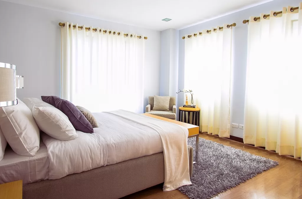
Beige and cream are versatile neutral colors that lend themselves beautifully to interior design.
You can use cream as an accent color to infuse the space with subtle elegance and softness by incorporating it through accessories such as pillows, curtains, or decorative items.
On the other hand, beige is an excellent choice as a primary color for walls or larger furniture pieces, creating a warm and inviting atmosphere.
Beige Use in Interior Design
Beige is a warm, light brown color that exudes a sense of comfort and timelessness.
It is frequently used as a neutral base color for walls, flooring, and larger furniture pieces.
Beige creates a cozy and inviting atmosphere and can serve as a versatile backdrop for a variety of design styles.
It pairs well with earthy tones and natural materials like wood, stone, or rattan, providing a seamless blend with rustic,
Mediterranean, or classic design aesthetics. To create striking contrasts, you can combine beige with bold or vibrant accent colors like navy blue, deep green, or rich burgundy.
Cream Use in Interior Design

Cream is a pale, off-white color that brings a soft and elegant touch to interior spaces.
It is commonly used as an accent color for furniture upholstery, curtains, pillows, or decorative accessories.
Cream adds a sense of sophistication and refinement to a room.
It pairs well with a wide range of colors and can serve as a canvas to highlight other elements in the space.
You can combine cream with pastel shades to create a soft and delicate palette, or pair it with darker tones to achieve a sophisticated and elegant contrast.
When using beige or cream in interior design, consider the existing color palette, lighting conditions, and the overall atmosphere you want to achieve. Experiment with different shades, textures, and accent colors to create a balanced and visually appealing space that reflects your personal style.
Beige Vs Cream: Use in Fashion
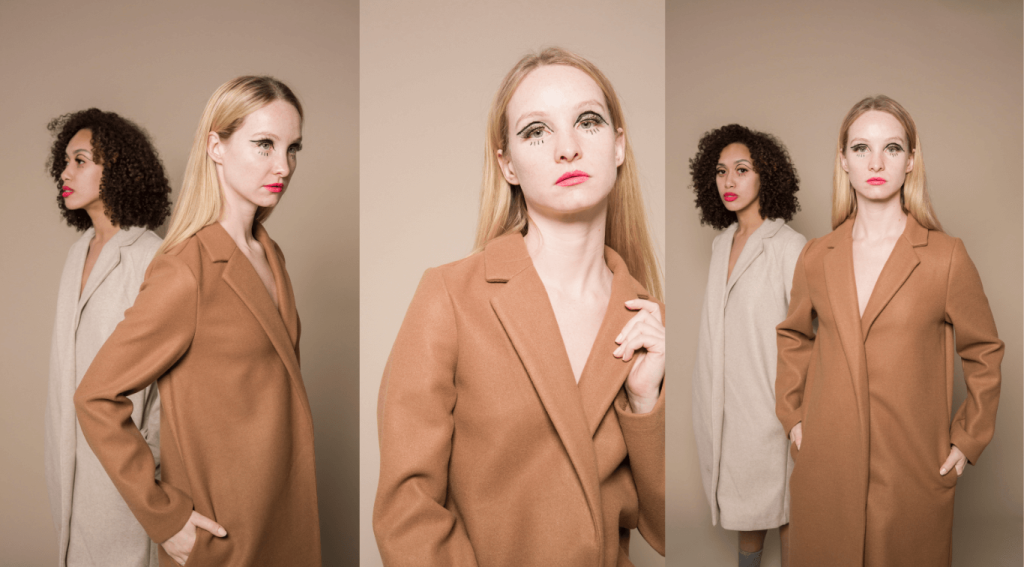
In fashion, beige and cream are both popular neutral colors that can be used in a variety of outfits.
Designers often use beige as a base color for clothing, while they commonly use cream in accessories like shoes and handbags.
People can wear both colors with a variety of other colors, and they work well in both casual and formal settings.
Beige Use in Fashion
Beige associates itself with earthy and neutral tones, commonly found in a range of clothing items like pants, skirts, blazers, and outerwear.
It remains a favored choice for crafting casual and relaxed looks.
To create a harmonious and natural color palette, beige pairs effortlessly with other earth tones like olive green, camel, or tan.
Additionally, beige serves as a complementary backdrop for bold colors such as burgundy or navy, offering an added contrast to the ensemble.
Cream Use in Fashion

Cream has a romantic and elegant vibe, making it a popular choice for dresses, blouses, and formal wear.
It is often used in spring and summer fashion to create light and airy looks.
It pairs well with pastel colors like blush pink, baby blue, or mint green, enhancing a feminine and dreamy aesthetic.
Cream can also be combined with metallics, such as gold or silver, for a touch of glamour.
Versatility and Styling
Beige and cream possess versatility, making them suitable for a range of fashion styles.
They serve as excellent neutral base colors that easily harmonize with various patterns, textures, and accessories.
Beige proves to be highly adaptable, lending itself well to casual and everyday wear.
On the other hand, cream frequently graces more sophisticated or formal occasions.
When selecting between beige and cream, take into account your personal style, skin tone, and the desired mood you wish to convey through your outfit.
Seasonal Considerations
Beige proves itself to be a versatile color that adapts effortlessly to both warm and cool weather, making it suitable for year-round wear. It seamlessly transitions between seasons, offering a versatile choice.
Cream, on the other hand, is often linked with the light and airy vibes of spring and summer. However, don’t discount its potential for winter outfits. By layering cream with cozy fabrics and combining it with deeper tones, you can successfully incorporate it into your winter ensembles.
Conclusion
To sum up, beige and cream are two neutral colors that have a lot in common, but also some key differences. Beige is a warmer, earthy color that can be used as a primary color, while cream is a lighter, more delicate color that works well as an accent. Ultimately, the choice between these two colors depends on the look you’re going for and how you plan to use them in your designs.