
Have you ever found yourself struggling to distinguish between two colors that seem almost identical? It can be frustrating, especially when you’re trying to pick out an outfit or choose the perfect shade for a room. Two colors that are often confused are maroon and burgundy. Despite their similar appearance, these colors have distinct differences that are worth exploring. In this article, we’ll take a closer look at maroon vs burgundy and uncover all the nuances that set them apart.
Maroon Vs Burgundy: What’s the Different?
Introduce Maroon in one sentence
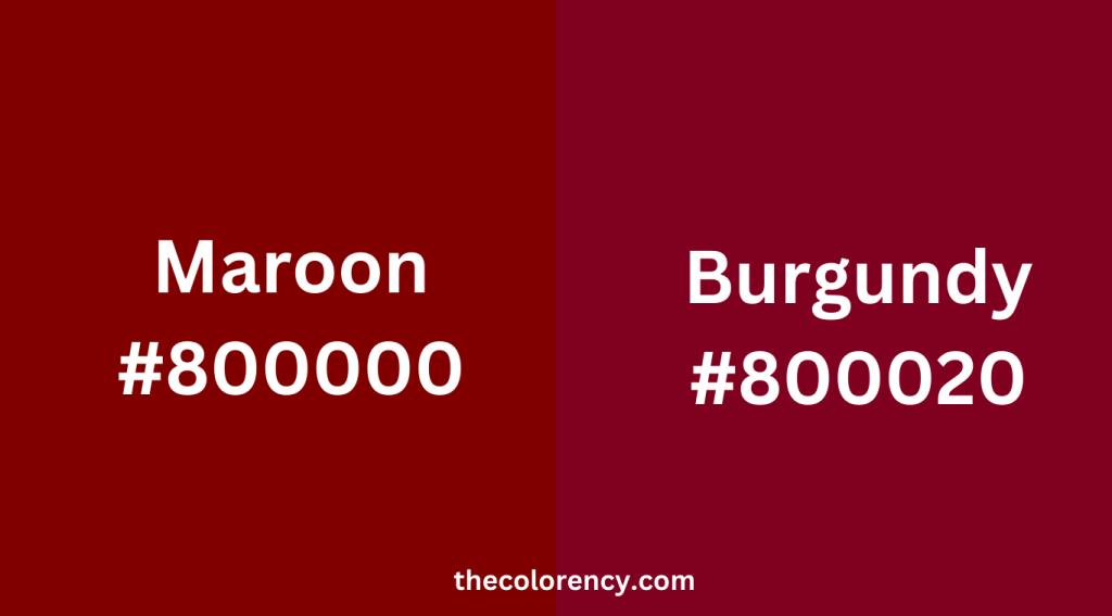
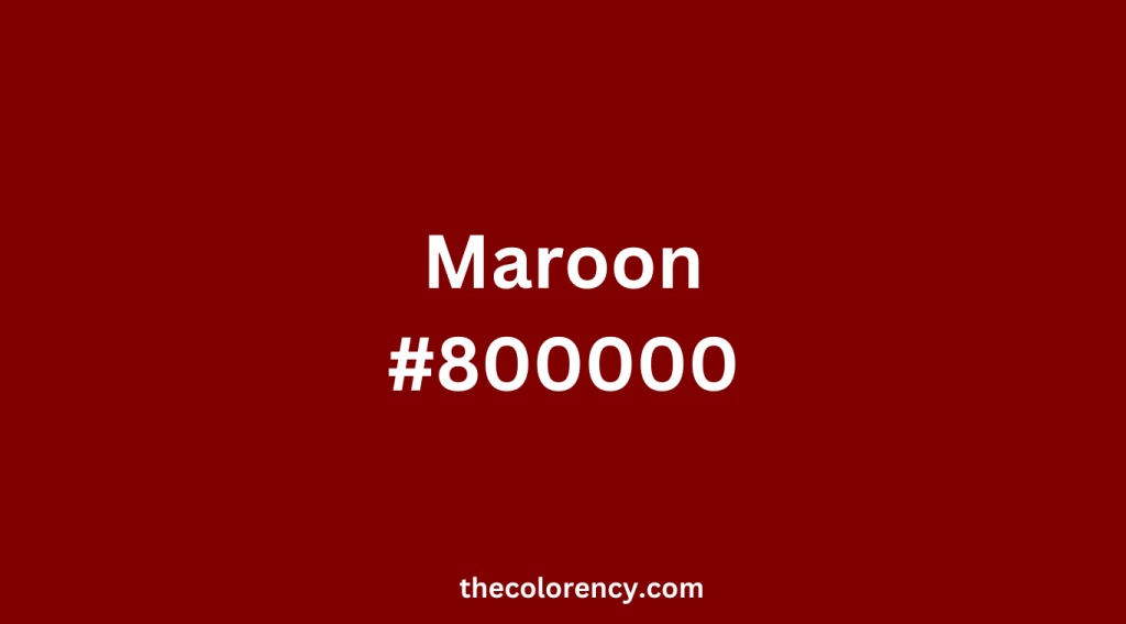
Maroon is a deep, rich shade of red with a brownish undertone.
Introduce Burgundy in one sentence
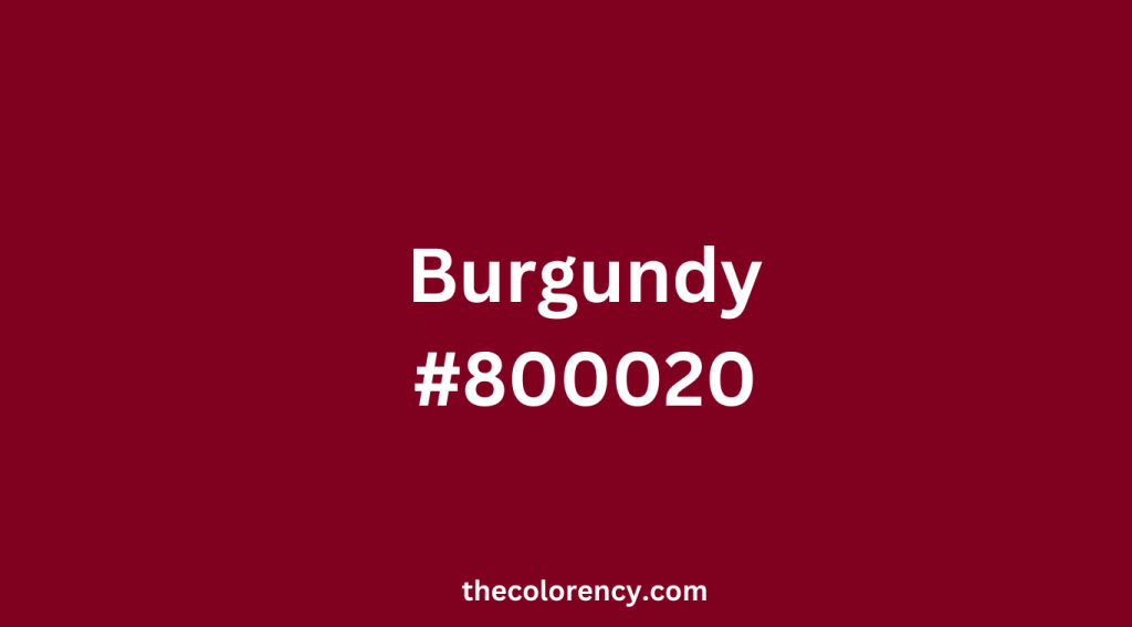
Burgundy is a dark, sophisticated shade of red with a purplish undertone. It is often associated with luxury, elegance, and sophistication.
Maroon vs Burgundy: HEX Codes
The HEX code for maroon is #800000, while the HEX code for burgundy is #800020.
Base Color of Maroon and Burgundy
Both maroon and burgundy belong to the red color family, but maroon has a brownish undertone while burgundy has a purplish undertone.
Maroon Vs Burgundy: Where Does the Name Come From?
Maroon is believed to come from the French word “marron,” which means chestnut. This likely refers to the reddish-brown color of chestnuts, which is similar to the color of maroon. In the 18th century, the word “maroon” was also used to describe a dark red or brown color.
Burgundy, on the other hand, is named after the region of Burgundy in eastern France, which is famous for its wines. The color burgundy is often associated with the deep red color of some of these wines, particularly the Pinot Noir grape variety.
Maroon vs Burgundy: Color Match
Color Match of Maroon
Maroon is a versatile color that can be paired with a variety of other colors to create different moods and effects. Here are some color match suggestions for maroon.
Complementary Colors
The complementary color of maroon is green, so shades of green such as forest green or olive can create a striking contrast with maroon. This can be especially effective in graphic design or fashion.
Neutrals
Maroon pairs well with neutral shades such as white, black, gray, and beige. These colors can help balance out the richness of maroon and create a classic, timeless look.
Other Warm Tones
Maroon is a warm color, so other warm tones such as orange, yellow, and gold can create a harmonious, inviting effect. This can be especially effective in home decor or fall fashion.
Cool Tones
While maroon is a warm color, it can also be paired with cool tones such as blue or purple to create a sophisticated, unexpected look. These colors can help balance out the warmth of maroon and create a more complex color palette.
Color Match of Burgundy
Gold
Burgundy and gold is a classic color combination that exudes luxury and glamour. Gold accents such as jewelry, belts, and shoes can really elevate a burgundy outfit or add a touch of opulence to a burgundy-themed event. Gold also works well as a background color for burgundy invitations, menus, and other paper goods.
Navy Blue
Navy blue is a timeless color that pairs beautifully with burgundy. This combination creates a sense of depth and balance that is visually pleasing. Navy blue can be used as a complementary color in patterns or as a solid color for a more understated look. When paired with burgundy, navy blue can create a sophisticated and elegant aesthetic.
Mustard Yellow
For a more vibrant and playful look, consider pairing burgundy with mustard yellow. This color combination adds a modern and fresh twist to burgundy and creates a fun and exciting look. When using these colors, it’s important to balance them out with neutral colors like white, gray, or black to avoid overwhelming the eye.
Emerald Green
Emerald green is another bold color that works well with burgundy. This combination creates a rich and opulent look that is perfect for formal occasions. When using these colors together, it’s best to stick with one dominant color and use the other as an accent. For example, a burgundy dress with emerald green earrings or shoes can create a stunning and sophisticated look.
Black
Burgundy and black is a classic combination that creates a sleek and sophisticated look. Black can be used as a base color for burgundy outfits or as an accent color in accessories such as bags, shoes, or belts. This pairing works well in both casual and formal settings and can be easily dressed up or down.
Maroon Vs Burgundy: How It is Made
The process of making maroon and burgundy colors depends on the specific medium in which they are being used, such as paint, fabric dye, or digital design software. However, in general, both colors can be created by mixing red with other colors to achieve the desired shade and undertones.
Maroon
To make maroon, red can be mixed with brown, black, or purple to create a darker, more muted tone. The exact ratios of each color will depend on the desired shade, but generally, a higher amount of red and a smaller amount of brown, black, or purple will create a brighter maroon with more red undertones. Conversely, a higher amount of brown, black, or purple and a smaller amount of red will create a darker, more muted maroon with more brown or purple undertones.
Maroon’s palette formula
- Red: 50%
- Brown: 30%
- Purple: 20%
To create the desired shade of maroon, the amount of each color used is important. For a brighter and more vibrant maroon, increase the amount of red and decrease the amount of brown and purple. Conversely, for a darker and more subdued maroon, increase the amount of brown and/or purple and decrease the amount of red. It’s important to note that there is no one correct formula for maroon as the proportions can vary depending on personal preference and design needs. Nonetheless, this basic formula can serve as a helpful starting point for creating a range of maroon shades.
Burgundy
To make burgundy, red can be mixed with blue and a touch of black or brown to create a deeper, richer tone. The blue helps to create the blue-red undertones that are characteristic of burgundy, while the black or brown adds depth and richness. The exact ratios of each color will depend on the desired shade, but generally, a higher amount of red and a smaller amount of blue, black, or brown will create a brighter burgundy with more red undertones, while a higher amount of blue, black, or brown and a smaller amount of red will create a darker, more muted burgundy with more blue undertones.
Burgundy’s palette formula
- Red: 50%
- Blue: 30%
- Black or brown: 10-20%
To get the right shade of burgundy, the amount of each color used matters. For a brighter burgundy, add more red and less blue and black/brown. For a darker burgundy, add more blue and black/brown and less red. Blue is important because it gives burgundy its blue-red undertones, which makes it different from maroon. Burgundy is considered a cooler and more elegant color associated with luxury.
Final Thoughts
While maroon and burgundy may seem similar at first glance, they are different colors with their own unique characteristics. Maroon is warmer and has a brownish undertone, while burgundy is cooler and has a purplish undertone. Understanding the differences between these two colors can help you choose the right shade for your needs, whether it’s for clothing, interior design, or branding.
In conclusion, maroon and burgundy are two distinct colors that have their own unique tones, uses, and associations. By knowing the differences between the two, you can make informed decisions when it comes to color selection.