
Pink is an incredibly versatile colour, and it’s no wonder why it’s so popular amongst people of all ages. To give you some inspiration, this blog post will explore the different shades of pink and the reasons why they may be perfect for your next project.
What is Pink?
Pink is a colour that is a mix of red and white. It has a wide range of tones and shades, ranging from soft, pastel pinks to vibrant magentas. Pink can be used to create a range of looks, whether it be romantic and sweet or sassy and vibrant.
This color is often associated with femininity and romance, but it’s also a powerful and empowering colour. Pink can also evoke feelings of joy, optimism, and playfulness. No matter what look you’re going for, there’s sure to be a shade of pink that will help you create it.
The Meaning of Different Shades of Pink
Different shades of pink can have different meanings. Soft, muted pinks are often seen as gentle and calming, while brighter pinks can be energizing and cheerful.
Light pinks are often used to represent innocence, while darker shades can convey power and strength. Magenta is often used to represent creativity and passion. Hot pinks can stand out and make a statement, while pastel pinks can be subtle and romantic.
Combining Different Shades of Pink
When combining different shades of pink, it’s important to consider the overall look you’re trying to achieve. For a soft, romantic feel, try combining light pinks with pastels. If you want something more vibrant and eye-catching, combine brighter hues with magenta or hot pink.
No matter what combination of shades you choose, remember to keep your colour palette cohesive. You can do this by pairing similar shades together or by using complementary colours.
Popular Shades of Pink

The following are some of the most popular shades of pink:
Bubblegum Pink
Bubblegum pink is a bright, cheerful hue that evokes a sense of childhood innocence and joy. This shade is often used in nurseries and children’s rooms, as well as for fun and playful designs.
Rose Quartz
Rose quartz is a beautiful, pastel shade of pink that is often used for romantic designs. It’s also associated with gentleness and unconditional love, making it perfect for weddings and other special occasions.
Fuchsia
Fuchsia is a vibrant and bold shade of pink that can be both daring and sophisticated. It’s often used to create powerful statements and to attract attention.
Salmon
Salmon pink is a lovely hue that is often used in nature-inspired designs. It’s a warm and inviting shade, but it can also be energizing and cheerful.
Blush
Blush is a soft, muted shade of pink that is often used as a neutral colour. It can be used to create a light and airy feel, and it pairs well with other pastel colours.
How to Use Different Shades of Pink
Now that you’re familiar with the different shades of pink, it’s time to learn how to use them in your designs. Here are some tips for incorporating different shades of pink into your projects:
Add Accents
If you want to add a hint of pink to your design without overwhelming the space, try using it as an accent colour. This could be through a few touches of pink on furniture or accessories, or through wall art or wallpaper.
Create Contrast
Using contrasting shades of pink can create a visually interesting look. For example, if you paint your walls salmon pink, you could pair it with lighter accents of blush or fuchsia.
Make a Statement
If you want to make a bold statement with your design, opt for brighter shades of pink like fuchsia or hot pink. You could use it in a single room, or throughout your entire home for a truly eye-catching look.
Avoid Overwhelming
When using different shades of pink, it’s important to avoid overwhelming the space. If your design is too pink, it can become overwhelming and garish. Try balancing out the pink with other colours, such as neutrals like white or grey.
Conclusion
No matter what look you’re trying to achieve, there’s sure to be a shade of pink that will help you create it. From light and airy to bold and vibrant, pink has a wide range of tones and shades that can bring your project to life.
Take some time to experiment with different shades of pink to see how you can incorporate them into your designs. With the right combination of shades, you can create a stunning look that is both beautiful and unique.
This blog post explored the different shades of pink and the reasons why they may be perfect for your next project. Remember to keep your colour palette cohesive when combining different shades of pink, and to avoid overwhelming the space with too much pink.
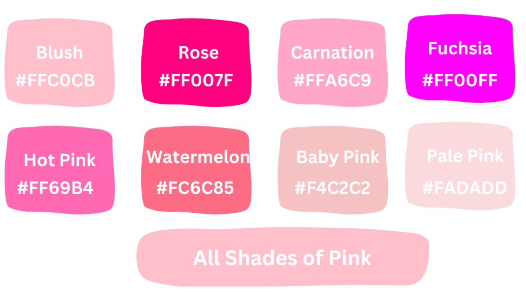
Chart: Different Shades of Pink and Their Hex Codes
| Shade | Hex Code |
|---|---|
| Blush | #FFC0CB |
| Rose | #FF007F |
| Carnation | #FFA6C9 |
| Fuchsia | #FF00FF |
| Magenta | #FF00FF |
| Hot Pink | #FF69B4 |
| Bubblegum | #FFC1CC |
| Salmon | #FA8072 |
| Coral | #FF7F50 |
| Taffy | #F987C5 |
| Watermelon | #FC6C85 |
| Ruby | #E0115F |
| Orchid | #DA70D6 |
| Lavender | #E6E6FA |
| Lilac | #C8A2C8 |
| Mauve | #E0B0FF |
| Plum | #8E4585 |
| Berry | #990066 |
| Dusty Rose | #DCAE96 |
| Rose Gold | #B76E79 |
| Pink Champagne | #F1DDCF |
| Pale Pink | #FADADD |
| Baby Pink | #F4C2C2 |
| Cotton Candy | #FFBCD9 |
| Strawberry | #FF43A4 |
| Raspberry | #E30B5C |
| Maroon | #800000 |
| Wine | #722F37 |
| Brick Red | #CB4154 |
| Rust | #B7410E |
| Mahogany | #C04000 |
| Chestnut | #954535 |