
A well-chosen color palette can make a huge difference in setting the tone and mood for a room, event, or any other type of design project. To achieve the best results, it’s important to understand which colors work best together. Knowing what colors go with red will not only make your design cohesive, but also create an eye-catching look that stands out from the rest.
In this comprehensive guide, we’ll take a look at the various colors that go with red, as well as some tips and tricks for putting together the perfect color palette.
How to Choose Colors That Go with Red
Choosing the right colors that go with red can be tricky, but it doesn’t have to be overwhelming. The key is to consider the color wheel and how the colors interact with each other. By understanding the effects of color theory, you can create a balanced palette that complements red and brings out its best qualities.
Understanding the Power of Color Harmony:
One fundamental principle in choosing colors that go with red is understanding color harmony. Red is a warm color, so it pairs well with cool colors like blues and greens. These complementary colors create a striking and balanced contrast. Additionally, analogous colors, which are adjacent to red on the color wheel, such as oranges and pinks, can create a cohesive and harmonious palette.
Exploring Contrast and Balance
Consider the shade of red you are working with. Vibrant and intense reds can be balanced with neutral colors like white, gray, or black to create a striking contrast. On the other hand, deeper or muted shades of red can be complemented by softer and more subdued tones like beige, brown, or earthy greens. This balance ensures that the red remains the focal point while allowing other colors to support and enhance its presence.
Experimenting with Accents and Patterns
Adding accents and patterns to your color scheme can further enhance the visual impact of red. A popular approach is to use red as an accent color itself, while incorporating other colors as primary or secondary hues. For example, a predominantly neutral space can be brought to life with red accent pillows, artwork, or statement furniture pieces. Additionally, patterns that feature red, such as floral or geometric designs, can provide depth and visual interest to your overall color scheme.
Primary Colors that Go with Red

When it comes to colors that go with red, the primary colors of red, blue and yellow are a great place to start. They work well together to create a bold and vibrant palette that will draw attention to your design. Red and blue create a classic combination that is often seen in the traditional American flag. Red and yellow create a bright and cheerful palette that is perfect for summer designs.
The Dynamic Duo of Red and Blue
Red and blue, two primary colors, create a powerful and energetic combination. This pairing evokes a sense of vibrancy and contrast, as the warm intensity of red meets the cool serenity of blue. When used together, they create a striking visual impact that is both visually appealing and emotionally captivating. Consider incorporating deep blues like navy or royal blue to create a bold and dynamic color scheme alongside red.
The Energetic Trio of Red, Yellow, and Blue
Combining all three primary colors – red, yellow, and blue – results in an explosion of energy and vibrancy. This trio creates a vibrant and lively color scheme that grabs attention and exudes a sense of playfulness. The warmth of red, the brightness of yellow, and the depth of blue interact in a harmonious dance, offering endless possibilities for creative expression. Whether in equal proportions or with one color taking the spotlight, this primary color trio ensures a dynamic and visually captivating palette.
The Artistic Allure of Red and Yellow
Red and yellow, often referred to as warm colors, create a captivating synergy that sparks creativity and joy. The combination of these primary colors yields a lively and energetic ambiance. Red’s intensity paired with yellow’s brightness results in a visually stimulating and uplifting color scheme. From bold red accents against a yellow backdrop to a balanced blend of both colors, this duo adds a touch of excitement and warmth to any space.
Secondary Colors that Go with Red
Secondary colors are created when two primary colors are mixed together. Since they are a combination of two colors, they tend to be more subtle and muted than primary colors. When it comes to colors that go with red, the secondary colors of green, purple and orange are excellent choices.
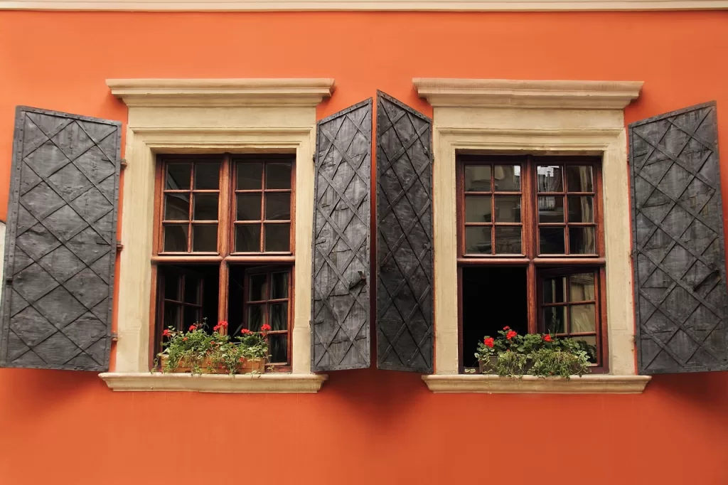
The Harmonious Blend of Red and Orange
Red and orange, both secondary colors, create a warm and inviting color combination. The fiery intensity of red merges effortlessly with the lively and energetic nature of orange, resulting in a visually striking and emotionally captivating palette. This combination exudes energy, enthusiasm, and a touch of playfulness. Whether used in equal proportions or with one color taking the lead, the blend of red and orange brings vibrancy and excitement to any space.
The Bold Contrasts of Red and Green
The pairing of red and green, two secondary colors, creates a dynamic and contrasting combination. Red’s intensity and green’s coolness create a visually captivating palette that draws attention. This combination is reminiscent of nature and provides a harmonious balance between warmth and serenity. Whether using deep forest greens or bright lime shades, the contrast with red creates a visually stimulating and captivating color scheme.
The Serene Harmony of Red and Purple
Red and purple, both secondary colors, come together to create a rich and regal palette. Red’s warmth and purple’s depth blend harmoniously, resulting in an elegant and sophisticated color combination. This pairing evokes a sense of luxury, creativity, and mystery. Whether using deep, royal purples or softer lavender hues, the combination with red adds depth and richness to any space, creating an atmosphere of opulence and allure.
Neutral Colors That Go With Red

Neutral colors are those that are not on the color wheel and are often used to provide a calming effect and balance to a design.
The Classic Elegance of Black and Red
Black, a versatile and timeless neutral color, forms a striking contrast when paired with red. This combination exudes drama, elegance, and a sense of power. Whether used in furniture, accent pieces, or as an accent wall, the marriage of black and red creates a visually captivating and sophisticated ambiance. Black acts as a grounding element, allowing the red to take center stage and adding a touch of refinement to the overall color scheme.
The Soft Warmth of Beige and Red
Beige, a warm and inviting neutral color, harmonizes beautifully with red to create a cozy and comforting atmosphere. This combination exudes a sense of warmth and serenity while maintaining an elegant and sophisticated look. Beige can be used as a wall color, upholstery, or as a backdrop for red accents, allowing the red to pop against a soothing neutral backdrop. The blend of beige and red creates a visually pleasing and harmonious palette that stands the test of time.
The Subtle Simplicity of White and Red
White, with its clean and crisp aesthetic, creates a fresh and timeless pairing with red. This combination offers a sense of purity, simplicity, and modernity. Whether used as a dominant wall color with red accents or as the main color for furniture and accessories, the contrast between white and red creates a visually striking and impactful design. The simplicity of white allows the boldness of red to shine, resulting in a captivating and balanced color scheme.
Conclusion
In conclusion, there are many colors that go with red to create a balanced and eye-catching palette. By understanding the effects of color theory and following a few simple tips, you can create a beautiful design that stands out from the rest. So why not give it a try? Get creative and have fun experimenting with different color combinations!