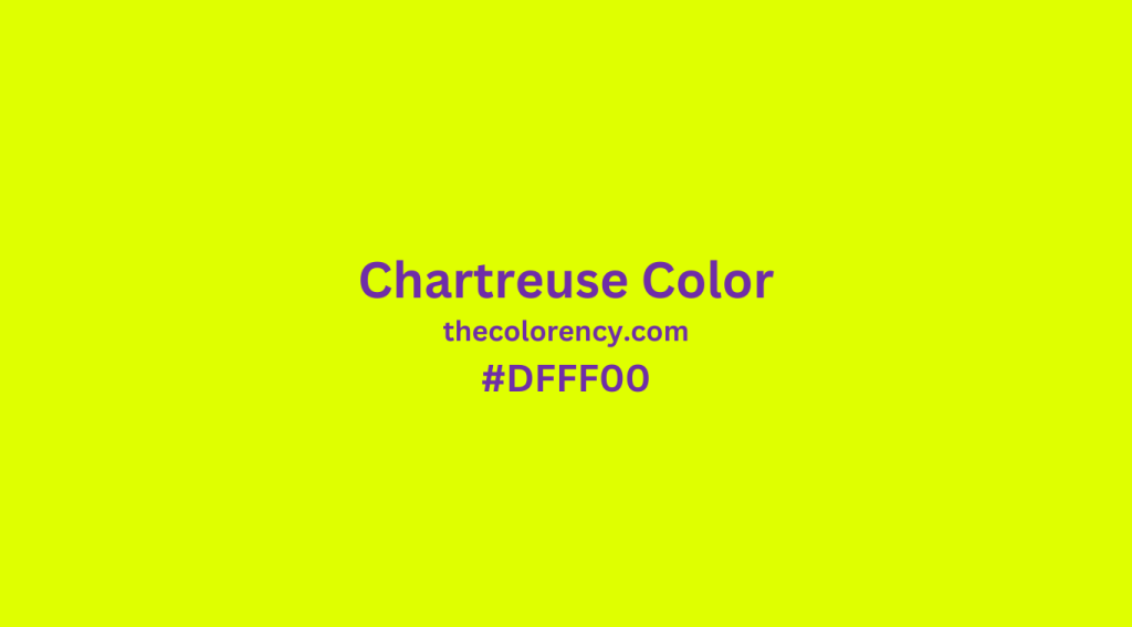
Chartreuse is an eye-catching, vibrant hue that has been used to make a statement in art, design, fashion, and beyond. From its origins as a natural dye to its current status as a popular color choice, chartreuse has a long and fascinating history. In this article, we’ll explore everything you need to know about the chartreuse color, including its history, symbolism, and uses.
What is the Color Chartreuse?
Chartreuse is a color in the yellow-green range of the spectrum, between yellow and green. It is a tertiary color, meaning it is made up of equal parts of yellow and green. The name “chartreuse” comes from the French word “chartreux”, which is the French word for “green”.
The color chartreuse is often used to describe any bright yellow-green color, but the original chartreuse color is a specific shade of yellow-green. It is sometimes referred to as “chartreuse green” to distinguish it from other green hues. The original chartreuse color is a bright, vibrant hue that is often associated with energy and vigor.
History
The chartreuse color has been around for centuries. In the 15th century, the Carthusian monks of the French Chartreuse monastery developed a special green liqueur, now known as Chartreuse. The liqueur was made with 130 herbs, flowers, and plants, and was reported to have miraculous healing powers. The liqueur was so popular that it was soon being produced in other countries, and the vibrant yellow-green color of the liqueur became known as “chartreuse”.
The chartreuse color was first used in art during the 19th century, when the Impressionists began to experiment with vibrant colors. The chartreuse color was used in many of their works, and soon it was being used in fashion, interior design, and more.
In the 20th century, the chartreuse color became even more popular. During the 1950s and 1960s, chartreuse was used in psychedelic art and fashion, and it was seen as a sign of rebellion and freedom. During this time, the color was also used in advertising, as it was seen as a bright and energetic color.
Symbolism
The chartreuse color frequently embodies energy, optimism, and vitality. It is commonly linked to youth, vigor, and exudes a sense of energy and excitement. Moreover, chartreuse carries connotations of freedom and rebellion, which contributed to its popularity during the 1960s.
Additionally, chartreuse color is closely associated with nature. It is frequently employed to evoke the sensation of being immersed in a lush and vibrant environment, making it a popular choice for nature-themed designs.
Uses of the Chartreuse Color
The chartreuse color is used in a variety of ways. In art, fashion, and design, it is often used to create a sense of energy and excitement. It is also used in advertising and branding, as it is seen as a bright and energizing color.
In interior design, the chartreuse color can be used to create a sense of calm and serenity. It is a great color for a living room or bedroom, as it can create a tranquil atmosphere.
The chartreuse color is also used in web design. It is often used as an accent color, to draw attention to particular elements of the page. It is also used in logos and branding to create a sense of energy and excitement.
Common Combinations with the Chartreuse Color
Designers frequently combine chartreuse color with other colors to craft vibrant and exciting palettes. They often blend it with various shades of green, such as lime green and olive green, to generate a lush and natural aesthetic. Additionally, chartreuse is commonly paired with blues and purples to establish a cool and calming atmosphere.
Moreover, the combination of chartreuse with other colors allows for the creation of unique and eye-catching looks. Designers often merge it with oranges and yellows to form a bright and cheerful palette. Additionally, chartreuse is frequently combined with reds and pinks to achieve a bold and vibrant appearance.
Chartreuse in the Home
Chartreuse color is an excellent option for various interior design projects. Its versatility allows for the creation of a range of atmospheres, whether it’s imbuing a space with energy and excitement or fostering a sense of calm and serenity. Popularly employed in living rooms, bedrooms, and kitchens, this color effortlessly establishes a tranquil ambiance or adds a vibrant touch.
Moreover, chartreuse color can serve as a captivating accessory in any room. It finds its way into throw pillows, rugs, and curtains, lending a lively and eye-catching appearance. Additionally, it can be incorporated into artwork and wall decorations, providing a colorful accent.
Chartreuse in Fashion
Chartreuse color offers a fantastic option for enhancing fashion looks. This vibrant shade is frequently employed to create bold and eye-catching ensembles. Statement pieces like jackets and dresses often incorporate chartreuse to infuse outfits with a lively and energizing vibe. Additionally, accessories such as shoes and handbags can benefit from the inclusion of this color to introduce a striking pop of vibrancy.
The chartreuse color is also a great choice for any makeup look. It is often used in eyeshadow and blush to create a vibrant and energizing look. It is also often used in lipsticks and nail polishes to create a bold and eye-catching look.
Conclusion
The chartreuse color is a vibrant and eye-catching hue that has been used to make a statement in art, design, fashion, and beyond. From its origins as a natural dye to its current status as a popular color choice, chartreuse has a long and fascinating history. Its symbolism of energy, optimism, and vitality make it a great choice for any project. Whether you’re looking to create a bold and vibrant look or a tranquil and serene atmosphere, the chartreuse color is a great choice.
