
Champagne and Gold are two elegant colors that can elevate the look and feel of any design or branding. While they may look similar at first glance, there are actually many differences between these two shades. In this article, we’ll take a closer look at Champagne vs Gold and explore their differences in code, value, and history.
Champagne Vs Gold:What’s The Different?
Introduce Champagne In One Sentence
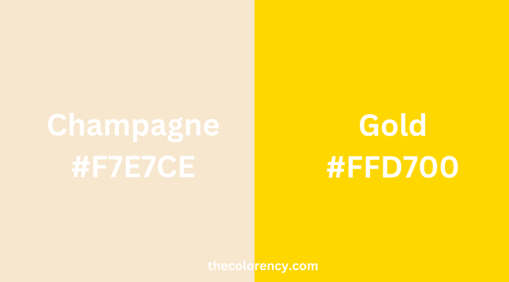
Champagne is a soft, pale shade of beige with a subtle hint of pink.
Introduce Gold In One Sentence
Gold is a metallic color that ranges from a bright, yellow hue to a deep, rich tone.
Difference In Code And Value
| Color | Hex Code | RGB Code | Hue | Saturation | Lightness |
|---|---|---|---|---|---|
| Champagne | #F7E7CE | RGB(247, 231, 206) | 38° | 54% | 88% |
| Gold | #FFD700 | RGB(255, 215, 0) | 51° | 100% | 50% |
Champagne has a code of #F7E7CE, which makes it a very light shade of beige. On the other hand, Gold has a code of #FFD700, which is a bright, vibrant yellow with hints of orange. In terms of value, Champagne is considered a low-value color, while Gold is a high-value color. This means that Gold is more intense and eye-catching, while Champagne is more subtle and subdued.
Champagne Vs Gold: Where Does The Name Come From?
Champagne gets its name from the famous sparkling wine produced in the Champagne region of France. The color is meant to evoke the light, golden hue of the drink, which is often associated with luxury, celebration, and elegance.
Gold, on the other hand, is named after the precious metal of the same name. Gold has been valued for its rarity and beauty for thousands of years and has been used in various forms of art, jewelry, and decoration. The color is meant to capture the bright, shiny appearance of the metal, which is often associated with wealth, success, and prestige.
Champagne Vs Gold: Matching With Other Color
When it comes to matching Champagne with other colors, soft pink, muted gray, ivory, and beige tones work well. Soft pink adds a romantic and delicate touch, while muted gray tones create a sophisticated and understated look. Ivory and Champagne create a timeless and classic color combination, and beige adds warmth and a sense of comfort to the overall design.
Gold, on the other hand, matches well with contrasting and deeper shades. Navy blue creates a striking contrast with Gold, adding depth and richness to the overall design. Forest green complements Gold, creating a natural and earthy color scheme, while deep red adds a bold and dramatic touch. Black and Gold create a classic and elegant color combination that exudes luxury and sophistication.
Conclusion
| Category | Champagne | Gold |
|---|---|---|
| Color Description | Soft, pale beige with a subtle hint of pink | Metallic color that ranges from a bright, yellow hue to a deep, rich tone |
| ColorHex Code | #F7E7CE | #FFD700 |
| RGB Code | RGB(247, 231, 206) | RGB(255, 215, 0) |
| Hue | 38° | 51° |
| Saturation | 54% | 100% |
| Lightness | 88% | 50% |
| Value | Low | High |
| Name Origin | Champagne region of France | Precious metal of the same name |
| Associations | Luxury, celebration, elegance | Wealth, success, prestige |
| Matching Colors | Soft pink, muted gray, ivory, beige tones | Navy blue, forest green, deep red, black |
Although Champagne and Gold may appear similar initially, they have distinct differences. Champagne is a muted, pale beige shade with a subtle pink undertone, while Gold is a metallic color that can range from a bright yellow hue to a deep, rich tone. Apart from their dissimilar codes, values, and origins, they also have different color pairings. Being aware of these distinctions can help you incorporate Champagne and Gold into your projects effectively and create the desired impact.