
Aqua and turquoise are two beautiful shades that are often used in fashion, home décor, and web design. They are very similar in color, and sometimes the differences between the two can be subtle.
In this article, we’ll explore all the differences between aqua and turquoise, and to help you appreciate and use both colors.
Aqua Vs Turquoise: What’s The Different?

Introduce Aqua In One Sentence
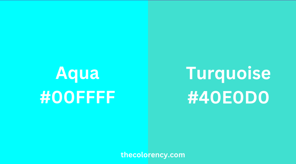
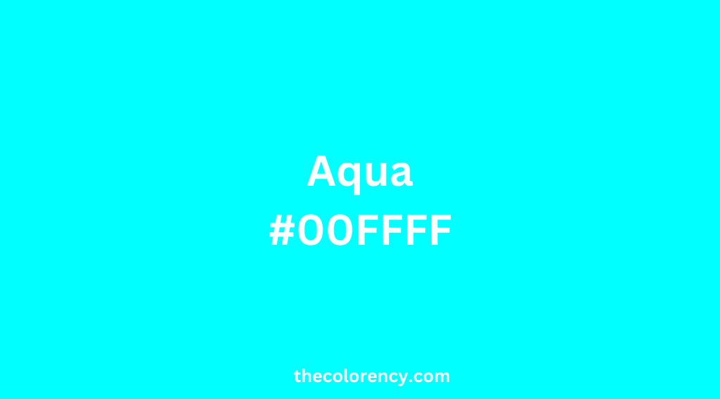
Aqua is a calming and refreshing shade of blue-green that is reminiscent of the color of water.
Introduce Turquoise In One Sentence
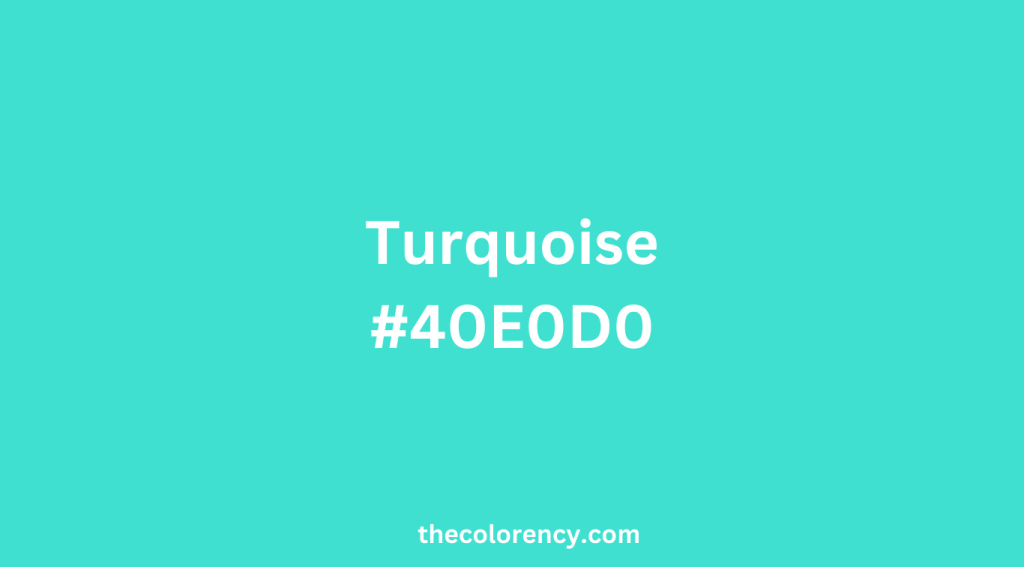
Turquoise is a vivid and energetic shade of blue-green that is named after the turquoise gemstone.
Difference In Code And Value
The first major difference between the two shades is the color spectrum and hue.
| Color | Shade | Saturation | Lightness |
|---|---|---|---|
| Aqua | Light | High | Medium |
| Turquoise | Darker | Medium-High | Medium |
| Color | Hex Code | RGB Code | Hue | Saturation | Lightness |
|---|---|---|---|---|---|
| Aqua | #00FFFF | 0, 255, 255 | 180 | 100% | 50% |
| Turquoise | #40E0D0 | 64, 224, 208 | 174 | 72% | 56% |
Aqua Vs Turquoise: Where Does The Name Come From?
The name “Aqua” comes from the Latin word for “water.” This is no surprise, as the color Aqua is often used to represent the color of water or the sea.
The calming and refreshing qualities of water make Aqua a popular choice for designs that are meant to evoke feelings of peace and tranquility.
Aqua is a lighter shade of blue-green that is often used in beachy or nautical themes, and is also popular in interior design for bathrooms and spas.
On the other hand, “Turquoise” has a more exotic origin. It comes from the French word “turquoise,” which means “Turkish stone.”
The gemstone was originally brought to Europe from Turkey, and the name stuck. The color of the stone is a blue-green shade, which is why the color is also referred to as “turquoise.”
Turquoise is a more intense shade of blue-green that is often used in bohemian or southwestern themes, and is popular in jewelry and fashion.
Aqua Vs Turquoise: What colors go with ?
| Color | Other Colors That Go Well With It |
|---|---|
| Aqua | Blush Pink, Light Yellow, Lavender, White, Beige, Gray |
| Turquoise | Red, Orange, Yellow, Amethyst, Emerald Green, Black, White, Gray |
Matching Aqua With Other Colors
Aqua is a lighter shade of blue-green that has a more muted, pastel feel to it.
It pairs well with other pastel colors, such as blush pink, light yellow, and lavender.
These colors create a soft and feminine look that is perfect for a beachy or bohemian vibe.
Aqua also pairs well with neutrals such as white, beige, and gray.
This creates a calming and relaxing feel that is perfect for a spa-like atmosphere.
Matching Turquoise With Other Colors
Turquoise is a darker, more vivid shade of blue-green that has a more intense and vibrant feel to it.
It pairs well with bold colors such as red, orange, and yellow, as well as with other jewel tones such as amethyst and emerald green. These colors create a luxurious and exotic feel that is perfect for a bohemian or southwestern vibe.
Turquoise also pairs well with neutrals such as black, white, and gray. This creates a sleek and modern feel that is perfect for a fashion-forward look.
Conclusion
| Aqua | Turquoise |
|---|---|
| Lighter shade of blue-green | Deeper shade of blue-green |
| Contains more green than blue | Contains more blue than green |
| Name comes from the Latin word for water | Name comes from French word for Turkish |
| Often associated with tropical or beachy themes | Often associated with Southwestern or Native American design |
| RGB values: (0, 255, 255) | RGB values: (64, 224, 208) |
| Used in branding for companies like Tiffany & Co. and Airbnb | Used in branding for companies like Ford and Southwest Airlines |
| Commonly used in interior design for accents and textiles | Commonly used in jewelry and fashion design |
| Has a calming and soothing effect | Has a vibrant and energizing effect |
| Can be found in nature in the form of tropical waters or certain gemstones | Can be found in nature in the form of certain minerals and gemstones, such as turquoise |
| Popular color choice for weddings and other formal events | Often used in casual or bohemian fashion styles |
| Can be paired with white, pink, or coral for a soft color palette | Can be paired with orange, red, or yellow for a bold color palette |
In summary, aqua and turquoise are two beautiful shades that are very similar, yet have distinct differences. Understanding these differences can help designers use them effectively in their designs. Whether you’re looking for a calm, soothing atmosphere or a bold, vibrant design, aqua and turquoise can both be excellent choices.